A Cityside Logo–and Its Student Artist–Take Shape
June 13, 2023
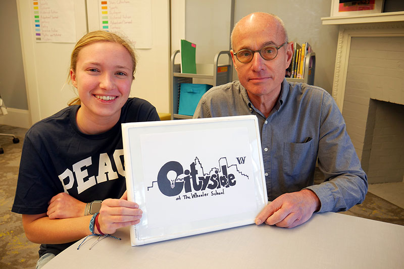
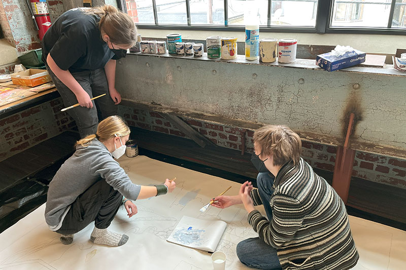
When Joe Baer P’08, the director of Cityside at Wheeler, asked Anna C. ’26 if she would be open to designing a logo for the program, she says she “jumped” at the opportunity. Anna was wrapping up her time last year with Cityside–highlighted by her work on the AS220 exhibit, “No Place to Call Home,” which focused on housing insecurity across Rhode Island–and she saw it as a chance to combine what she had experienced during the program with her love of art. “I spent a few weeks coming up with some ideas all while thinking, ‘What is Cityside?’ How can I make other people see that in a logo?” Anna remembers.
Cityside provides experiential learning opportunities for Wheeler 8th-graders throughout Providence’s 25 neighborhoods. Over the course of their year in the program, the students partner with various NGOs, non-profit organizations, community groups, and branches of government on projects that allow them to develop their inquiry and research skills while creating a positive impact across the city.
“One of our values in Cityside is to encourage student voice and agency so it made sense for a student to create our logo. I was really impressed by the creativity and richness of Anna’s artwork for the exhibit we installed in the AS220 gallery,” says Mr. Baer, who saw her bring those same skills and care to this project. “Anna didn’t rush to sketch out ideas but first wanted to understand the purpose of a logo and specifically how it might visually convey the ethos of Cityside. After drafting many possibilities, she embraced feedback and the messy iterative process while still maintaining her vision.”
Throughout the rounds of refinement, there were always a few constants in Anna’s design, including the word “Cityside” in big letters, with a lightbulb fit into the “C” and a gear appearing in the “d.” “When I thought of the Cityside program, I really thought about how a big focus is coming up with your own ideas, you really have freedom with them, and the teachers help you shape them,” Anna says. “The lightbulb was meant to represent the idea while the gear was meant to represent the gears turning in your head as you continued to learn and grow.” The final design also features the iconic Providence skyline rising behind and above the “Cityside” name, alongside the Wheeler “W.”
“The logo illustrates how our program and the school are part of the city and employs visual metaphors to convey ideation,” Mr. Baer says. “How cool is that?”
Anna hopes her design connects with people in different ways, depending upon whether or not they’ve gone through Cityside. “For those who have, I hope they can look at this logo and reflect on their experience and how it shaped them. That’s because to me, the logo is evidence of how it shaped me. To those who have not experienced Cityside, I hope the logo conveys an opportunity waiting for them, full of ideas and turning gears, ready to become what they choose to make it.”
Anna describes her Cityside experience as eye-opening. “I live in a very rural area surrounded by my own hands-on, nature-based classroom, and Cityside exposed me to an urban environment,” she says. “I went into 8th grade not knowing what to expect in Cityside. It quickly became something I looked forward to, constantly anxious to work on my project. I absolutely love art, and [through the AS220 exhibit], Cityside made it possible for me to create an art piece that could not only educate others on the issues of homelessness but also educate my classmates and me. At the end of the year, I was amazed to see how much this program helped shape me into who I am today. It taught me how to advocate for myself, speak with adults, properly introduce myself, send formal emails, and always keep an open mind. When I first sketched out that first version of the logo, I didn’t think that it would actually become the logo of the program. To me, designing this logo reminded me of the words [Head of School] AGP once told us” ‘Leave a place better than you found it.’ Seeing my logo become a reality makes me realize that I have. I learned and grew from this program and now I feel that I have made it grow too.”